

OVERVIEW
There are 33.3 million small businesses in the United States. Small Businesses generate 44% of U.S. Economic Activity which is why inventory management for small businesses is critical. According to Software Path, most small business owners are losing money because of their inaccuracy of tracking their inventory. Human error is the biggest area where it happens. According to Waspbarcode, 43% of small businesses in the United States don’t track inventory, or do so using a manual system like Excel spreadsheets.
Project Type: End-to-End App Student Project
My Role: Product Designer
Tools Used: Figma, FigJam, OptimalSort,
Duration: 4 weeks (80 hours)
PROBLEM
How can we help small businesses track inventory easily and faster so that they don’t lose money due to inaccuracy of tracking their inventory?
More specifically, can we build an application that is user friendly to make the users excited to use the system?
PROPOSED SOLUTION
During my research of the current inventory apps, I noticed that existing inventory apps are not very user friendly. My proposed solution is to develop an app called, Tory which will provide simple and easy way of tracking your business inventory so that you can concentrate more time on growing your business.
CHALLENGES
Have you ever thought you wanted solve a problem but you ended up changing the scope of the problem you wanted to solve? Well, that’s exactly what happened in this project.
I was initially trying to solve for a household problem where you accumulate so many things over the years that you don’t’ even know what you have and where they are! However, during my research phase of this initial problem, I quickly learned that these days, not too many people keep many things around their house. According to my research, 71% of the people I interviewed were minimalist and they know exactly where things are.
Then, I quickly changed the scope of my project and was able to complete it within the given deadline.
RESEARCH GOALS
Understand what motivates business owners to track inventory through a mobile app
Determine what pain points they have when tracking inventory through a mobile app
Explore how the stakeholders are currently tracking inventory
To achieve my research goals, I began researching on current market for inventory tracking apps. From my research, I’ve learned that the inventory management apps are targeting small business owners.
“Nearly half of small businesses use slow, ineffective manual inventory tracking methods”
Then, I assembled a competitive analysis to further understand what types of inventory tracking systems are out there.
Competitive Analysis
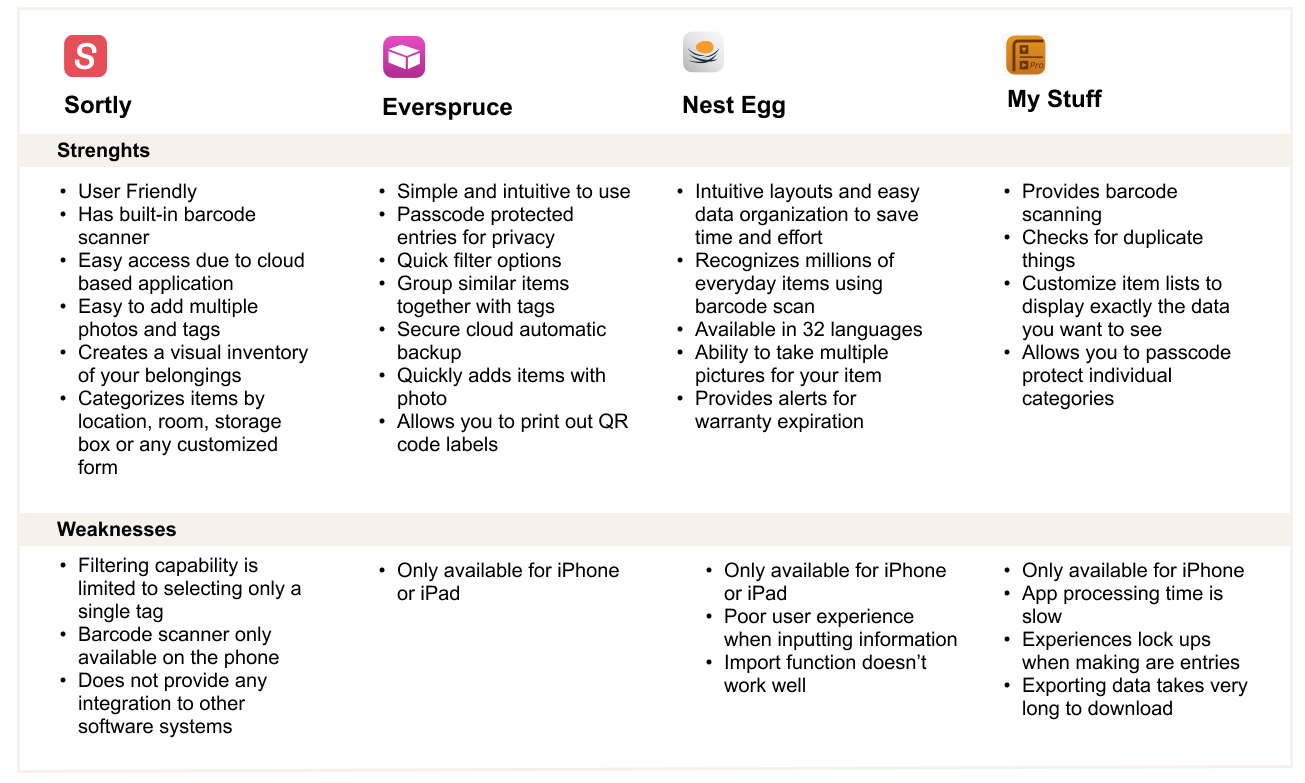
From my research, I learned that there are many inventory tracking systems trying to market business owners.
Businesses lose 1.75 Trillion per year to out-of-stocks, overstocks, and returns
By some estimates, item-level tagging, when implemented properly, can increase inventory accuracy from 63% to 95%
43% of retailers ranked inventory management as their number one day-to-day challenge
PERSONA
Before starting to design, I conducted several small business owners to understand their behaviors and what their needs are. Then I developed a user persona based on the customer interview research.
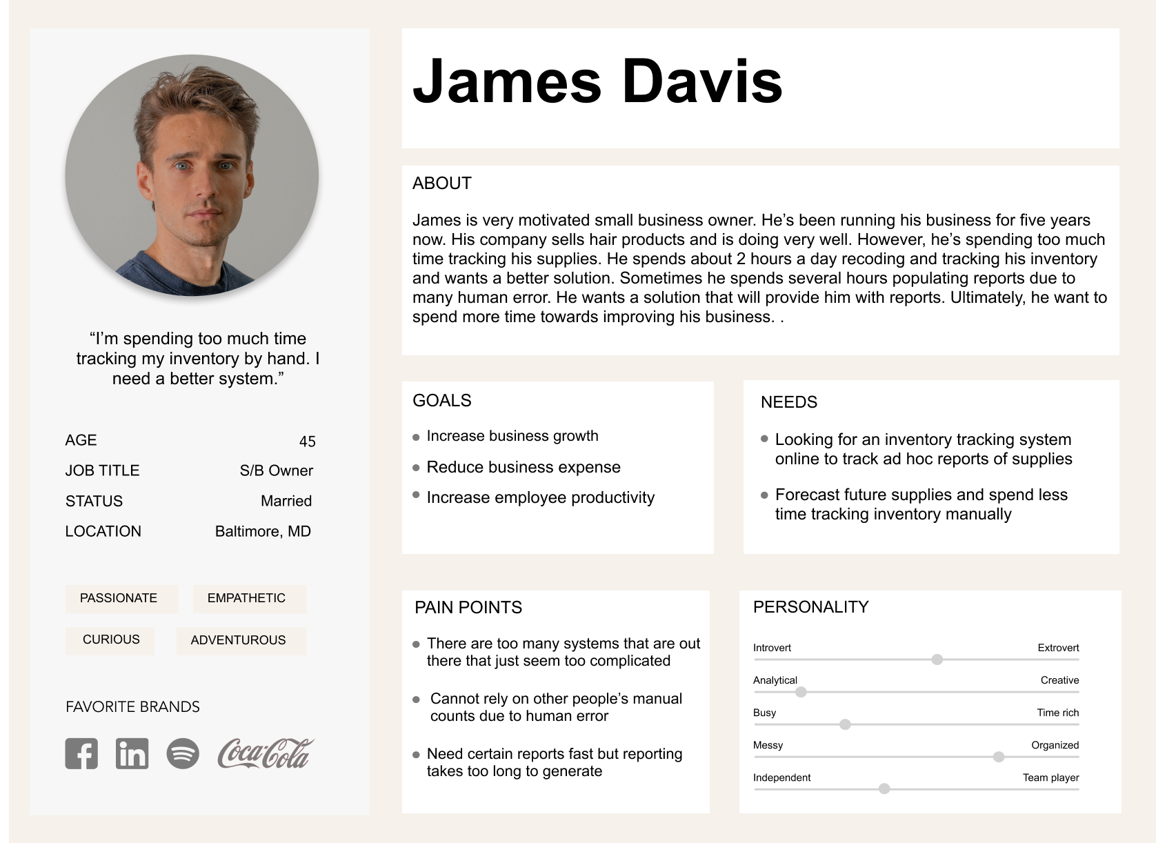
Meet James. He is a typical small business owner who wants to spend time growing his business instead of keeping track of his inventory. His greatest frustration is spending too much time tracking inventory and receiving inaccurate inventory count that will directly correlate to losing business revenue.
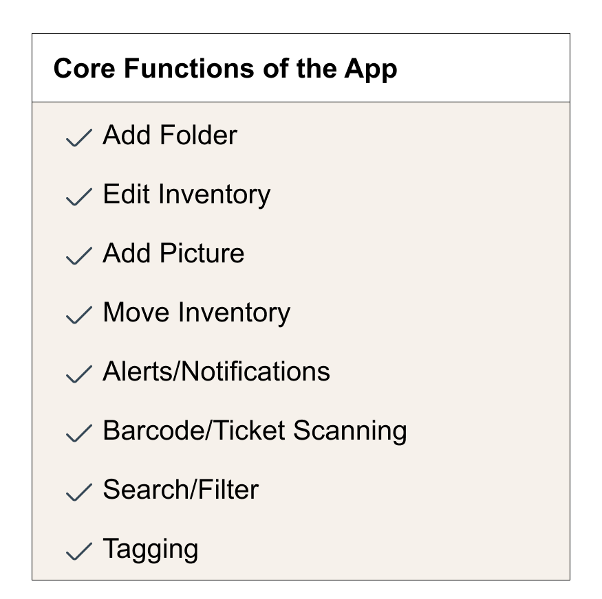
After accessing who the users would be for the inventory tracking app, I researched further on what features the users would find to be helpful to manage their inventory.
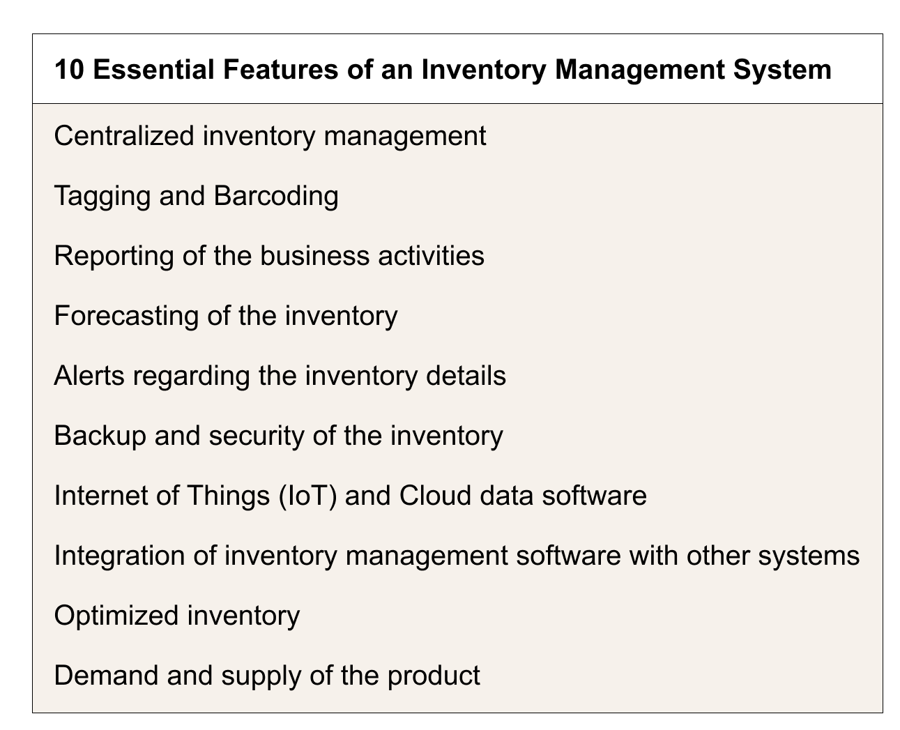
Essential features would be the ultimate goal of the app, however, for this project, I narrowed it down to these features that would play a major role in the most basic area of the inventory tracking app.
THE PROCESS
To understand what the process that the user will go through, I created user flows and task flows. The goal of this app is to make the process of entering the inventory as easy as possible. Let’s look at how the user will add an inventory.
TASK FLOW
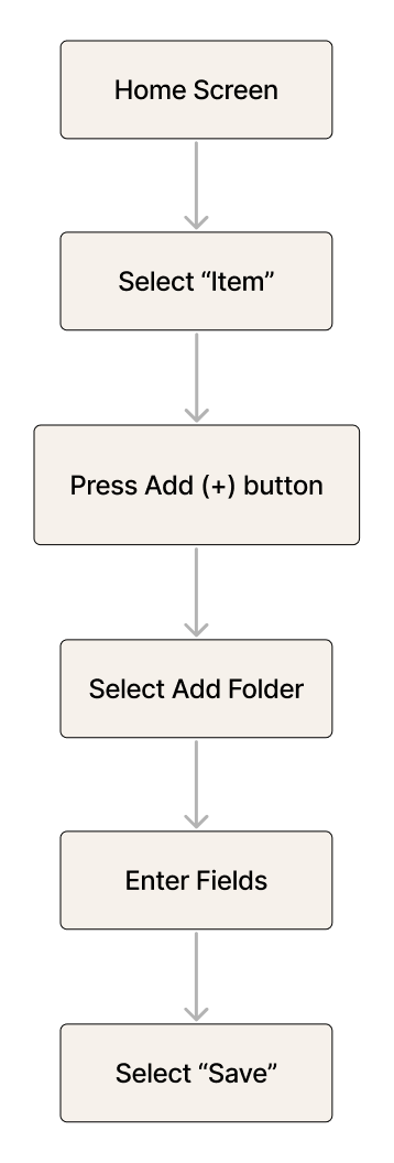
As you can see, the task flow is very straight forward. From the Home Screen, you can add your inventory simply by pressing Add button from your mobile device. The process should be intuitive where anyone with this app should find it easy to add an inventory.
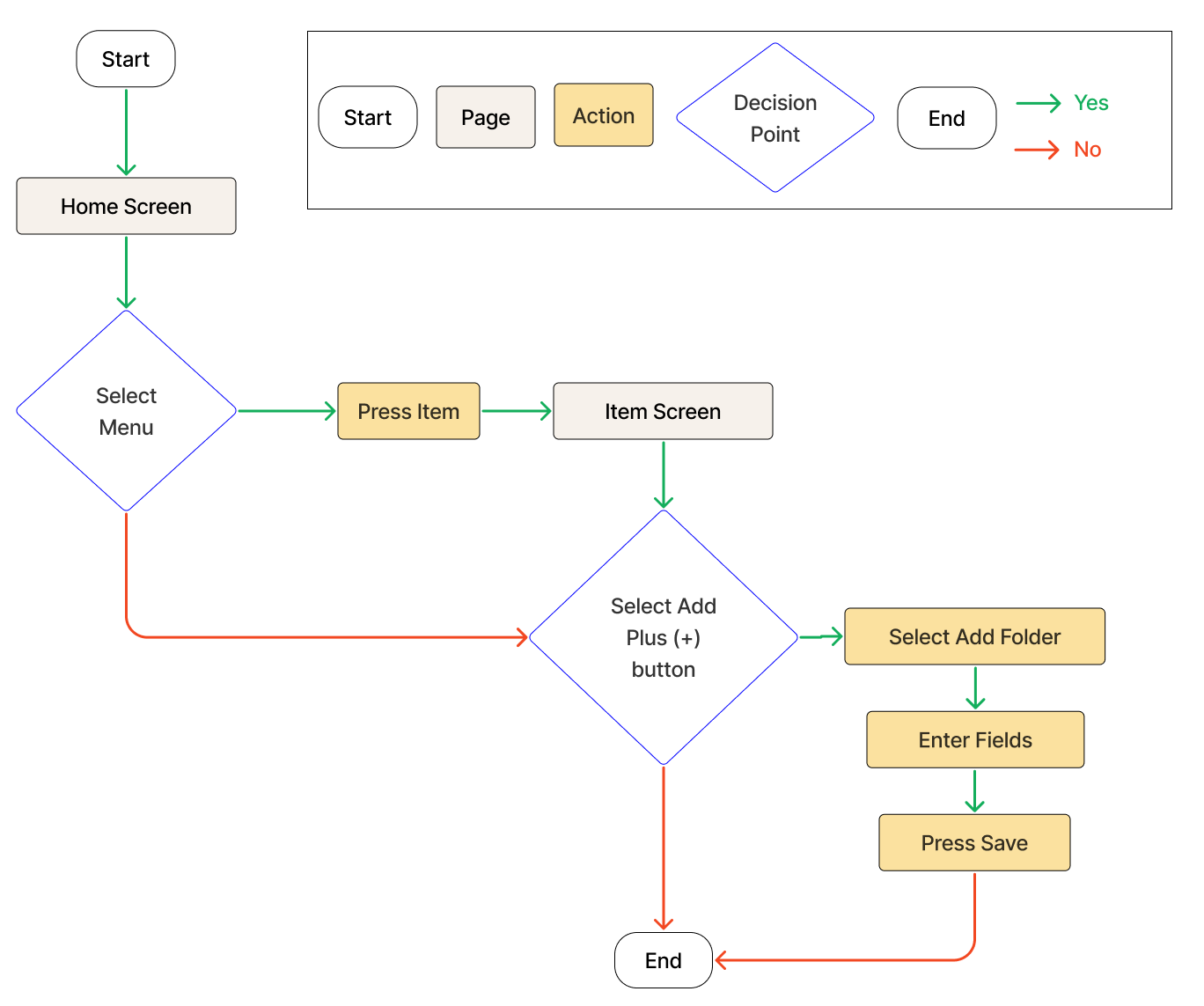
Now, let’s look more in detail of what exactly the user will go through.
USER FLOW
RESPONSIVE WIREFRAMES
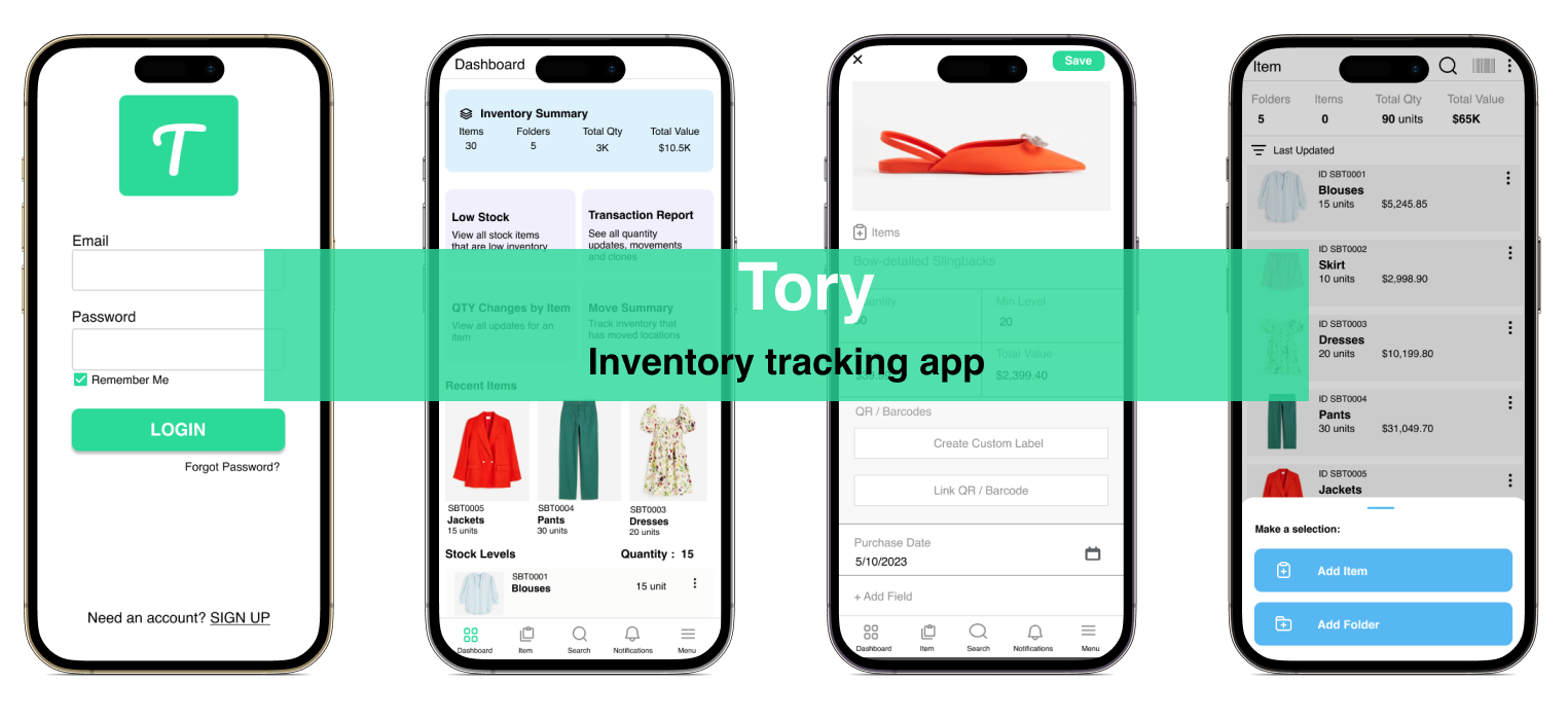
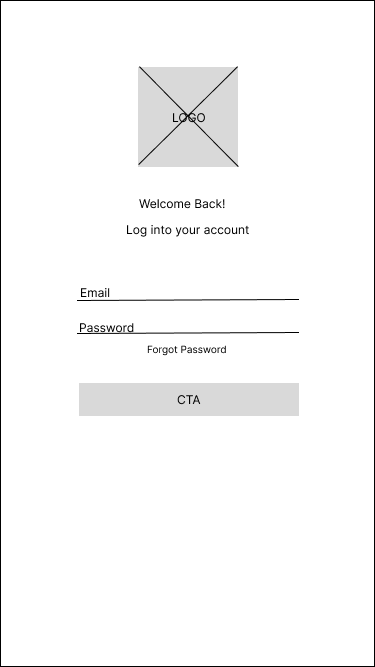
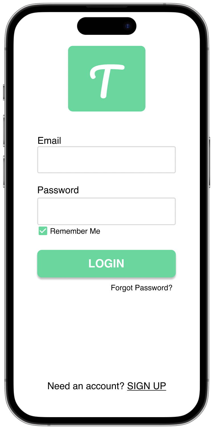
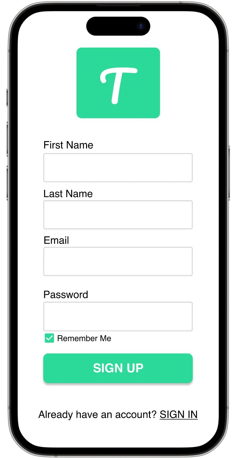
After understanding the process of what the users would go through, I started to design wireframes. I started with simple log in page.
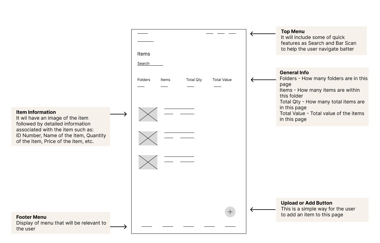
Then, I thought about how an inventory will get recorded. I started to design a wireframe for an inventory that will get recorded. The goal for this screen is to make the design simple and informative with the feature to add inventory very intuitive.
DESIGN
I started my design process by creating mood board. I knew my user is a business owner so I wanted to research on what colors schemes would work best. Here are some of the visual concepts that gave me inspiration.
MOOD BOARD

As you can see from the mood board, the color schemes are blue and green. I looked at these colors because those colors provide a sense of trust and reliability. Then, I started to explore style guide for my inventory app.
STYLE GUIDE
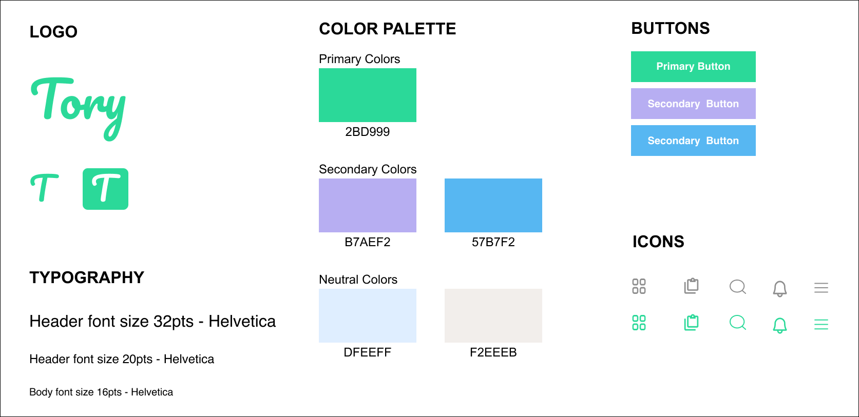
I designed the logo with simplicity and visibility in mind. Given the context of being an inventory app, I found inspiration in the term "Tory" derived from "Inventory." This would make it easy for the users to remember.
I researched on the colors and learned that green stands as the world's second most favored color, radiating positivity through its associations with growth, harmony, freshness, and progress. Taking inspiration from these qualities, I opted for a green shade to resonate with the Tory logo.
For the typeface, I chose Helvetica. The Helvetica font was deliberately selected for its clean lines and streamlined efficiency, ensuring compatibility with diverse content without compromising the overall design. Its widespread popularity as one of the most renowned and frequently used typefaces globally adds the advantage of familiarity for users, enhancing the overall user experience.
Hi-Fi WIREFRAMES
Once the style guide was completed, the next step involved the development of high-fidelity wireframes. This allowed me to preview and assess the visual representation before progressing to the full development stage.

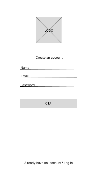
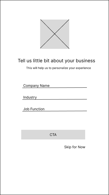
Smooth Log-In Experience
I designed a login page that feels warm and user-friendly. With the app being exclusively for mobile use, my main goal was to create an inviting and delightful experience, hoping to leave users with a positive impression and encouraging more sign-ups.
That is why, I've added a "Skip for Now" option. This gives you the flexibility to choose whether or not to provide your company information at this stage.

100%
80%
70%
AFFINITY MAP
ITERATION


Look and Feel
Creating a friendly atmosphere for the app was a priority for me. I incorporated gentle shades of popular colors like blue and purple to infuse a warm and inviting vibe. Through my competitive analysis, I observed that many inventory apps felt cold and challenging to navigate. To counter this, I opted for rounded corners in the design, contributing to a friendly and approachable user experience.
PROTOTYPE
I developed a prototype with the goal of refining design accuracy for the user and optimizing user interaction. To fine-tune the user experience, I honed in on testing the three most pertinent scenarios:
User will add an item to Tory app
User will add a folder to Tory app
User will edit/update an item using Tory app
USABILITY TESTING RESULTS
I used Maze to conduct a usability test specifically focusing on the three most utilized functions within the Tory app. A total of 10 users participated in the test, yielding valuable insights. Here are some key findings from the usability test:
All participant users were successful in adding a folder to the app
80% of the users were successful. in signing up for the app
70% of the users said the app is easy to use, has a good clear feel, and looks professional
Following the usability testing phase, I created an affinity map to systematically organize and categorize the findings. This method gave me a clearer understanding of user feedback, allowing for more effective identification of patterns, insights, and potential areas for improvement within the Tory app.
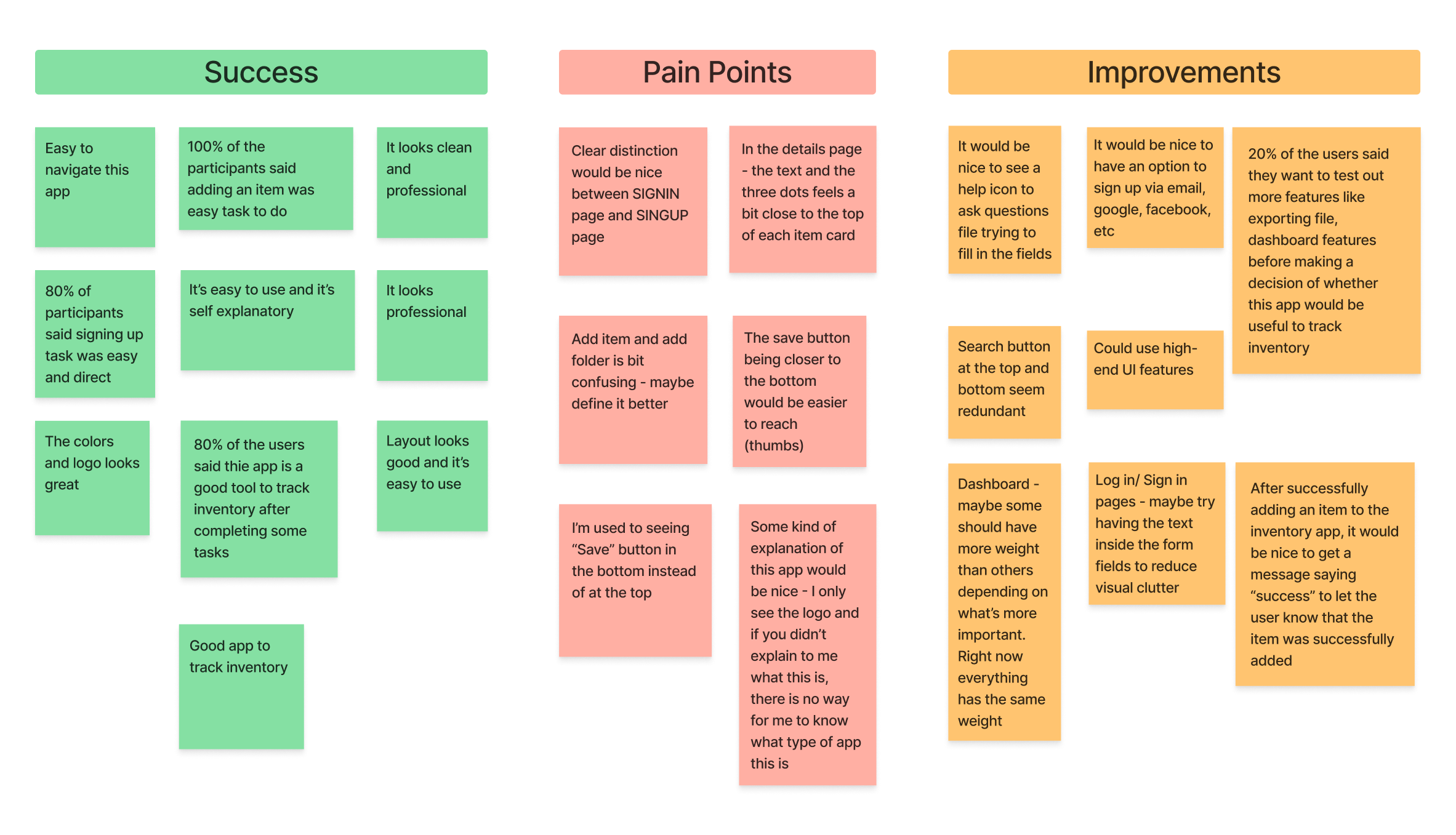
From the findings, I learned that users had a positive experience with the app. The insights gathered from their experiences also provided valuable information about certain pain points. This constructive feedback inspired me to explore and implement enhancements, ensuring a more seamless and enjoyable user experience for the future.
After carefully examining the pain points, I made changes to improve its usability. This involved addressing specific issues raised during the evaluation process, with the aim of creating a smoother and more user-friendly experience for all app users.
I first looked into the login screens. I felt that these screens were important since they are the gateway to a mobile app. Since this is the first interaction that the users would have I felt making improvement here would be crucial
LOGIN BEFORE & AFTER ITERATION:
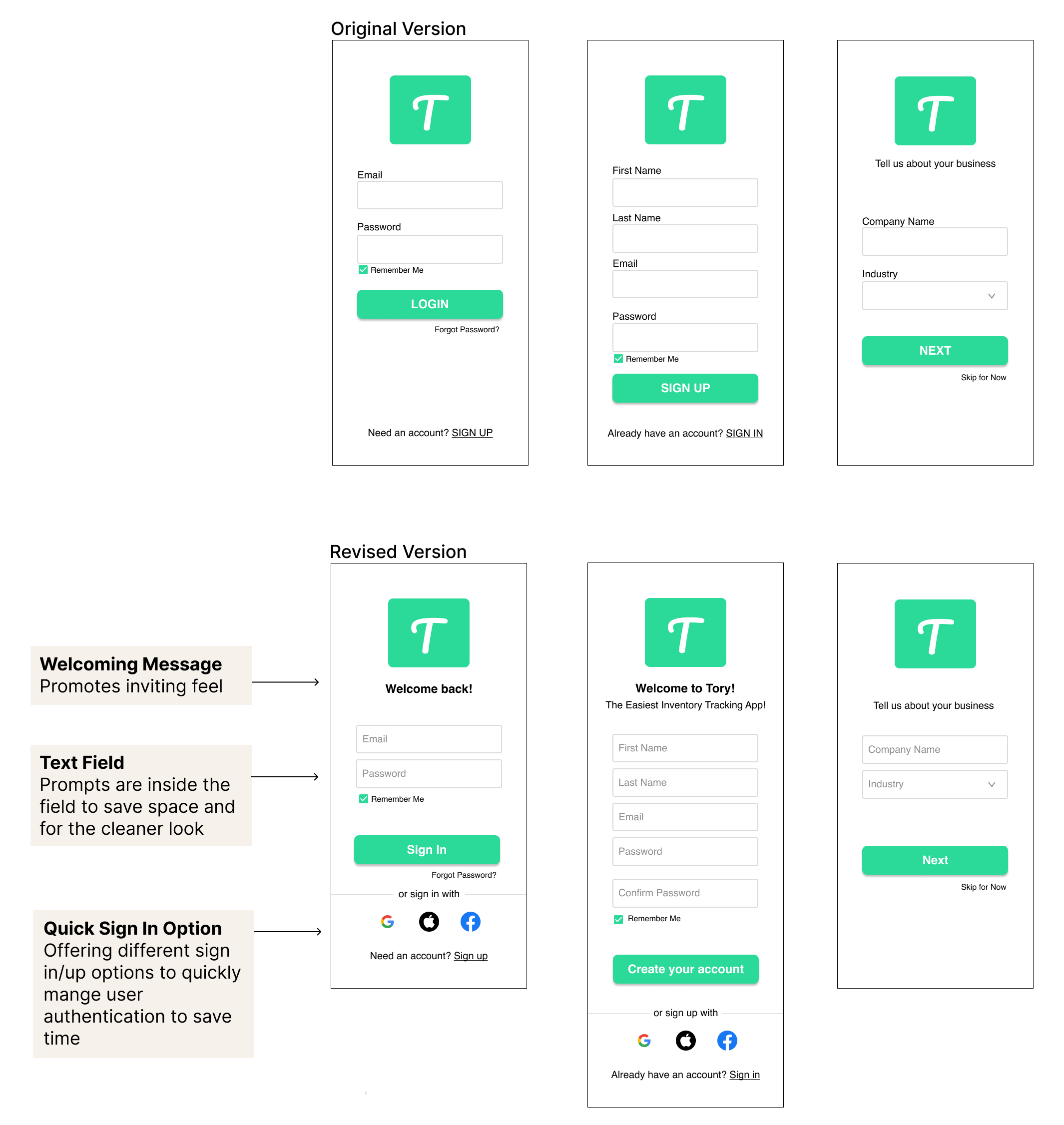
From this iteration, I was able to make the login/ sign up page
Be inviting to the users
Provide cleaner look & feel of the Tory app
Offer a quicker option to sign up to reduce the time
Another main functionality of the Tory App is adding your inventory. During the usability research, I found that although adding an item was easy to do, it was bit confusing due to the wordings.
ADD INVENTORY BEFORE & AFTER ITERATION:
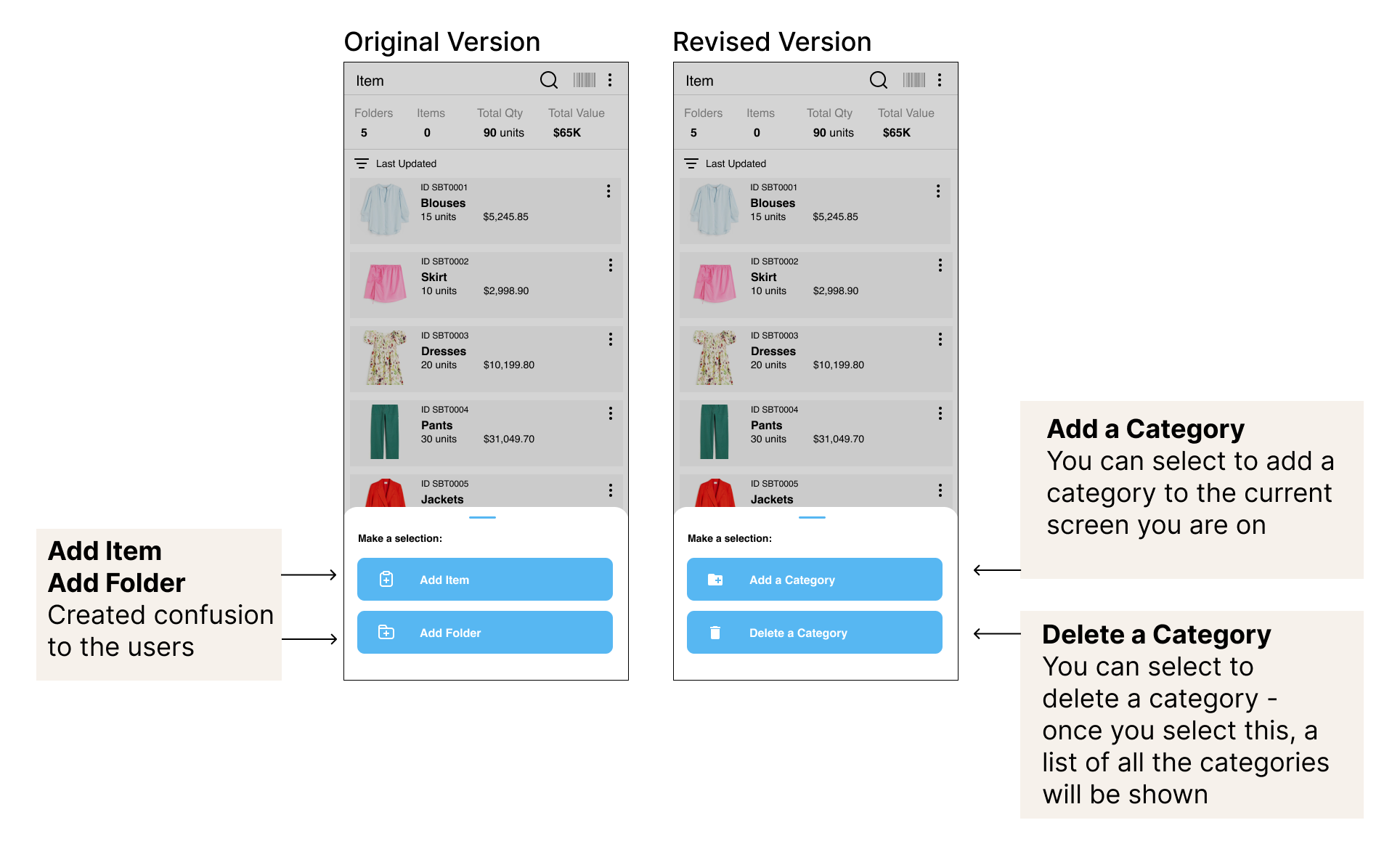
From this iteration, I was able to let the user make two selections:
Add a Category - Replaced Add Item, will allow the user to add a category to your current inventory list
Delete a Category - Replaced Add Folder, will allow the user to delete a category
Allowing the user to decide either to add or delete will create less confusion than asking the user to add either an item or folder
KEY TAKEAWAY
Testing & Iteration taught me that there is always room for improvement. However, it is always important to remember why people are using this app. The primary objective of this app is making inventory tracking easier for users and conducting thorough testing helps ensure that the app meets their needs
NEXT STEPS
Task Efficiency:
Pay attention to the efficiency of common tasks such as adding, editing, and deleting inventory items. Streamlining these processes can significantly contribute to the overall usability of the app.
User-Centric Approach:
Continue prioritizing user needs and preferences. Understanding the workflow and pain points of your users is crucial to delivering a product that genuinely enhances their experience in tracking inventory.
Iterate & Test:
Continue to iterate and test based on feedback to improve features that will allow the users to have better experience with the app.